
MODUL + TASK:
Bachelor Thesis
Briefing: How to bring craft techniques and manufacturing processes into a library?
WHEN + DURATION:
6th Semester Digital Ideation, 4 months
SOFTWARE + TOOLS:
Figma, Axure, Illustrator, html, Css, Javascript, bootstrap, netlify, GitHub
FURTHER INFORMATION
Main focus on Concept and visuell Content
UX/UI-Design
Collaboration with Stiftung Sitterwerk St. Gallen
Link to Website →
Starting Point
Target Group
User Journey
Process
Concept
Prototype-Testing
Information Architecture
Illustration
Style Tile
Conclusion
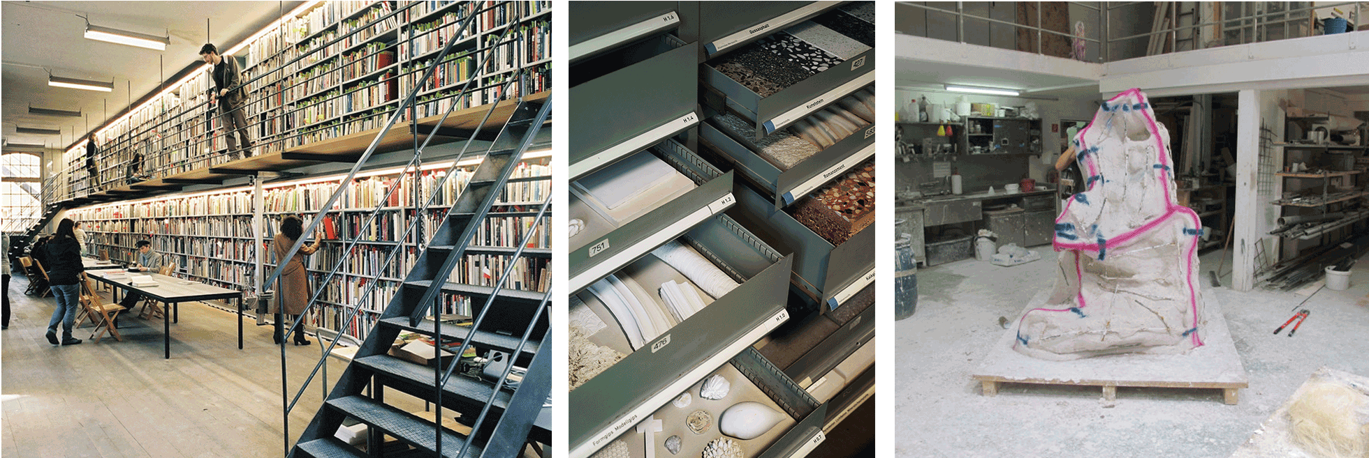
STARTING POINT Sitterwerk
- In the library Sitterwerk already exist various tools such as: Sitterwerk Katalog, Werkbank, Material-Archiv.ch. Through the different media and sorting, the user has the possibilities to become aware of books, objects, on which they would not have come across otherwise. None of the existing applications is focused on the craft processes of the objects.
- The Sitterwerk Katalog is designed for the books and the objects, with mostly material information and little explanation about the objects themselves. Mostly, visitors stay on one site of the library and work with the books or the objects.

TARGET GROUP
- The visitors of the Sitterwerk are a wide target group, consisting of art historians, designers, architects and artists. They are mainly professionals from different directions, which is why the web app is aimed at a professional audience.
-
On the basis of research interviews, which I conducted with 10 students and artists from the study programs interior design, architecture, object design and art, the following personas were created.
In the interviews with architects, it became clear that they need very precise information for materials and processes, which they receive directly from the manufacturers or other platforms, due to safety regulations. Other secondary personas that could be considered are Sitterwerk staff and art historians.

USER JOURNEY
- In the research interviews it became clear that the users find the haptics of the materials very important. When they were asked how they would like a library to look up, they all said they would like to touch the objects and would like to be able to access more information on their mobile phone or digitally.
- I thus narrow down the User Journey to the local situation at the Sitterwerk. When I was doing research in the library, I noticed that I had to gather information about the objects on several portals and labels. There are several problems in the use of the library, which would be too extensive to solve in this bachelor thesis. Therefore, I narrow my focus on the information of the objects with the core topic procedure. Furthermore, it is important that the user gets information about the objects in a timely manner and receives further suggestions for the research.

PROCESS
- The conceptual part of the work was as important as the visual part, which is why the product covers the needs of the users and is user-friendly. Through the surveys, testings and expert interviews not only the navigation and information architecture has been improved, but also content-related topics have been enhanced.
- Two smaller testings were conducted at Sitterwerk and supplemented with online testing. There were two iterations, in the first testing the focus was mainly on the format mobile phone, comprehensibility of Illustrations and the comparison tool. In the second testing, the focus was on content and navigation of the app.

CONCEPT
- For an easy access to the information, I decided to use QR Codes instead of RFID chips. The user can touch the object, explore it and at the same time get the information about the material and processes of the object. The web app gives a quick overview of how the object was made, but it is not meant to be a tutorial.
- The user can estimate how many process steps are necessary to make an object and obtains information where there are opportunities to interfere and influence the process. For more in-depth information on material or the process, the user has further links to the Material-Archiv.ch and suggestions for books in the local library.
Sometimes there are several ways to make an object and depending on the project, if the focus is on process or on the final product. To make this variety of possibilities visible and clear, a comparison tool has been created. These are related processes with which similar or the same objects can be produced in a different way. The comparison tool shows the most important features of the different processes in order to enable the user to classify or expand the choice of processes.


PROTOTYPE-TESTING
- Initially, the focus was on the desktop format. Based on the concept, the focus was shifted to the mobile phone size. In the mobile phone format, the challenge was particularly for the comparison tool. Since a lot of information has to be presented collectively on a small screen.
- Originally, the idea was that only one procedure is visible and the user can explore the others by scrolling. This feature was very confusing for the test persons. Nevertheless, the test persons said that it was an interesting tool.
Different layouts were also tried but the layout with the accordions were the clearest. The content information of the comparison tool was shortened and expanded again. The layout of the start screen and the detail pages with the corresponding procedures and illustrations was also reworked. On the detail pages, for example, the long scrolling was replaced by a carousel with illustrations. The illustrations in mold making and textiles are different due to the complexity of the process, so it seemed important to make the layout as unified as possible.

INFORMATION ARCHITECTURE
When the user has scanned the QR code, the start screen of the respective object is visible with brief material information and navigation to the different processes that the object is made. The user can move from the detail pages to the next page or return to the start screen.
The link to the related procedures (the comparison tool) was initially placed in a separate menu, but during the testing the people overlooked it.

ILLUSTRATION
- Firstly, I had two different approaches for the illustrations. On the one hand there were 3D illustrations with animations in Cinema 4D, on the other hand illustrations in isometric style. However, during the research interviews it turned out that animations move fast and are not helpful. The illustrations should not represent instructions but a fast approach to the techniques, so I am convinced that the isometric 3D illustration is a more suitable style.
- What should be shown in the illustrations? What is left out?
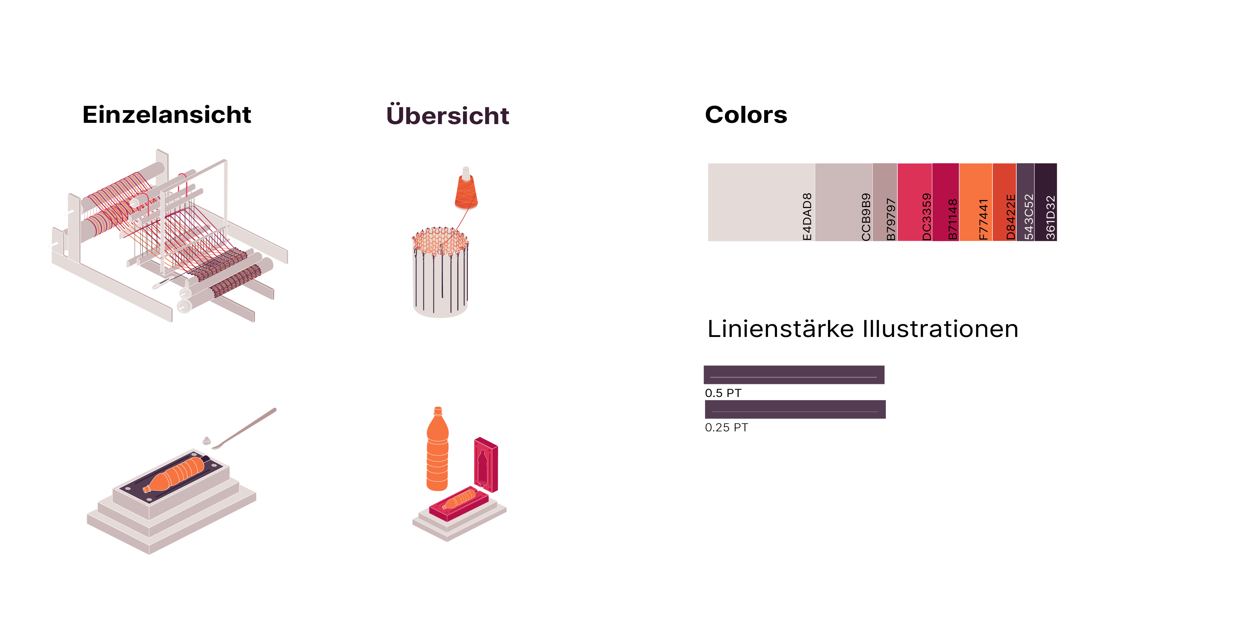
I compared different reference books, Material-Archiv.ch, video tutorials. Through, the different medias, I tried to abstract the most important actions and I started to draw processes. I deepened three different fields: textile weaving, mold making and extruding. The topics were intentionally chosen to be very different so that they are transferable to other processes from the Material-Archive.
Through the illustrations, the viewers should understand a sequence as quickly as possible to assess the complexity and to recognize attributes of the different processes.In the following overview of textile design, I have tried to narrow down the subject area. The technique of extrusion did not differ significantly from the textile illustrations, so I concentrated on mold making and textile surface design.
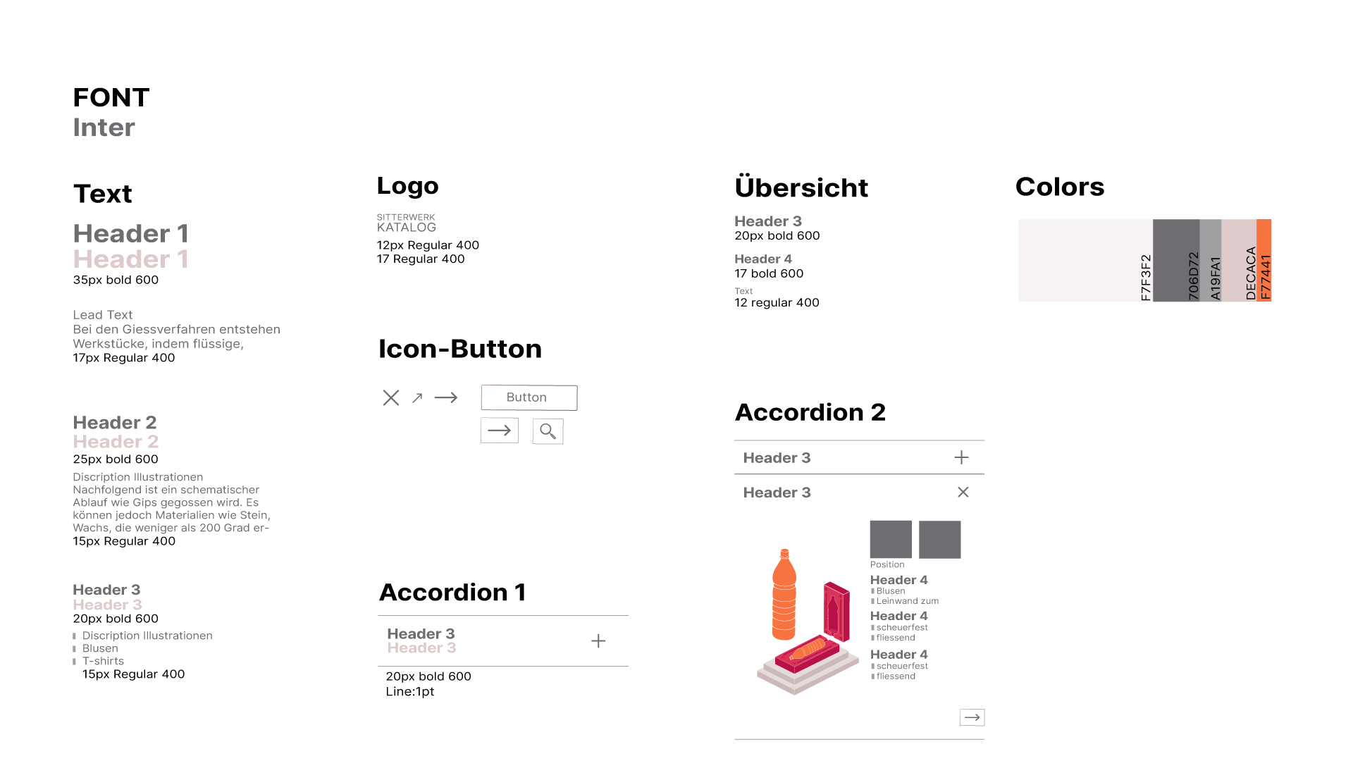
STYLE TILE
For the consistency in the design, I set up a style guide to structure and unify the fonts and buttons.
The illustrations vary in complexity, but if I had more simplified the loom, it would show too little information. Mold making and textiles are already very different in their materiality, reducing them to a common denominator would not enhance the understanding of the technique.
CONCLUSION
- The Web-App is an extension of the existing Sitterwerk Katalog and could be embedded into this site without any technical challenges. In this work I was able to use UX strategies, strengthen my design as well as conceptual skills.
- There is still a potential for improvement of the web app. For example that the user disconnects faster from the website and continues browsing the real archive. Navigation could also be improved in further testing.
The scalability of the project is another unsolved challenge. The comparison tool could show the scope of the different methods. Therefore, there would be the possibility for the archive Sitterwerk to illustrate the most important 15 basic procedures and to show the related techniques in the overview.
Furthermore, a detailed design system for the illustrations would have to be created so that another designer could continue this project.
The abstraction of the techniques and the size of the project, I had underestimated in the beginning. It was even more important to narrow down the project and the target group. The final prototype is a solid starting point to deepen this discussion.